Under the Covers
 Sketches courtesy of Ivan Brunetti
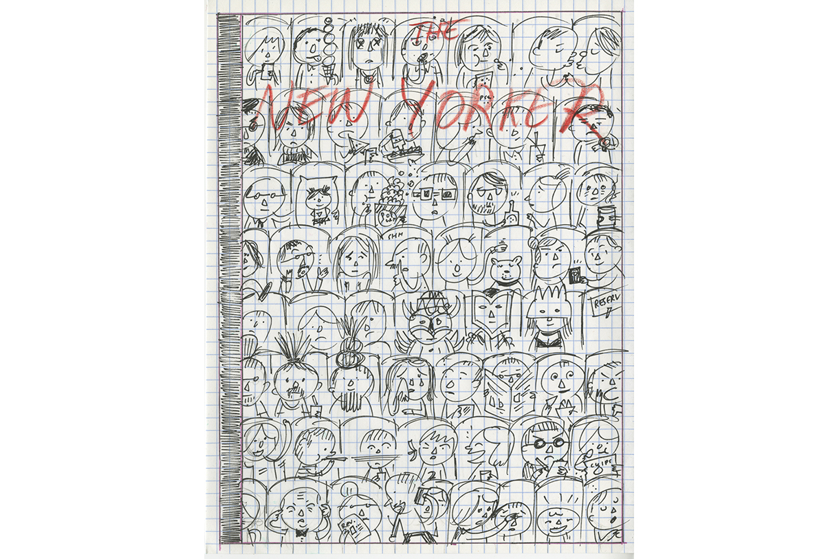
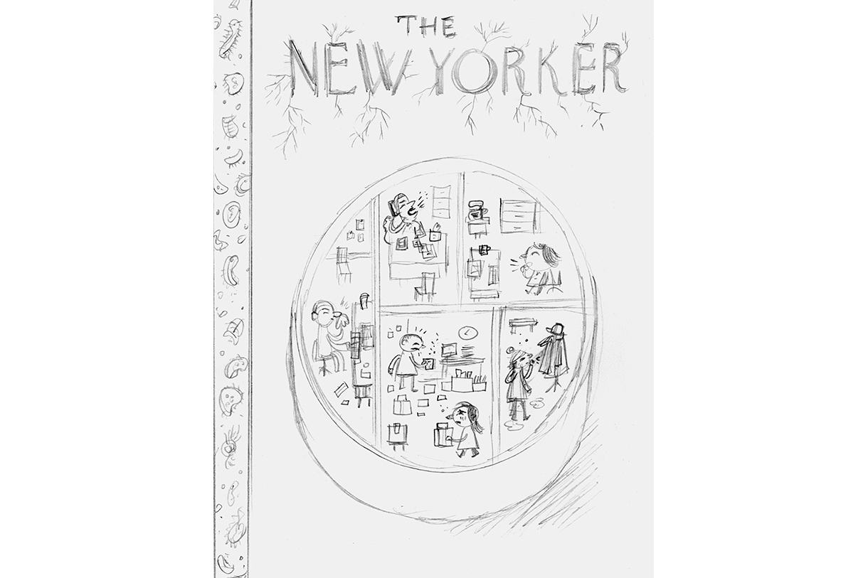 Sketches courtesy of Ivan Brunetti
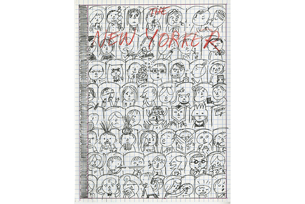
 Sketches courtesy of Ivan Brunetti
“Whenever I have tried to be clever, the results have been abysmal, go-nowhere failures,” says Ivan Brunetti, associate professor of Columbia College Chicago’s Design department. While the illustrator’s dark humor is a trademark of his work, Brunetti’s career is anything but a joke.
Brunetti’s Schizo #1-4, Haw! Horrible, Horrible Cartoons by Ivan Brunetti and Hee! Yet More Horrible Cartoons have solidified his legacy in the cartooning world. In addition, the artist has penned two memoirs, edited anthologies, curated comic exhibitions and created cover art for Patton Oswalt and musical group Tomahawk.
His knowledge goes beyond field-related experience – Brunetti is considered a comics scholar by many. This expertise helps direct his teaching, which he cites as his number one priority, and also informs some of his more famous publications, covers for The New Yorker. His most recent collaboration with acclaimed art editor Françoise Mouly, “At the Movies,” was published earlier this fall. Here, Brunetti explains that different covers require different timelines, and that the best work is made when we let ourselves be vulnerable.
How does the process start when you’re illustrating a cover for The New Yorker? Does Françoise Mouly come to you with specific ideas, or is it more hands-off?
The process is a little different for each cover. For the first cover I ever drew, I was inexplicably and unexpectedly sent an email request (along with many other undisclosed recipients), toward the end of the calendar year, to submit ideas for the few remaining issues that were still missing covers. I chose “winter sports” as a theme, but my cover sketch was actually more of a commentary on global warming, and Françoise liked that aspect: so she worked with me to further develop and clarify the environmental theme. It’s not the first thing you notice about the image; you have to piece it together.
The artists are never told what to draw; we submit our own ideas. We do receive a calendar of reminders that may spur the creative process (“technology issue” or “Mother’s Day” and the like), but the images are proposed and created by the artists. That’s very different from most other illustration assignments, which makes the New Yorker cover the ideal illustration assignment.
Once an initial sketch is accepted, there are still several steps before the image becomes a cover; these usually involve some degree of collaboration with Françoise, who is the world’s best art editor. She is great at isolating what makes the image compelling, and bringing the concept to its fullest, clearest, and most satisfying potential. Occasionally, there has been very little back and forth, and the final image ends up being very close to the first submitted sketch; most often there is quite a bit of discussion and revisions of sketches before moving to the final artwork. I imagine the process is different for each artist. From my experience, Françoise is one of the very, very few art directors sensitive to the artists’ various peccadilloes, idiosyncrasies, and temperaments. Sometimes, I think she knows me and my artwork much better than I do, and thus she can pinpoint its virtues (such as they are) and guide me toward refining the image. I’ve tried adopting this approach as a teacher: don’t tell the students what to do; rather, guide and challenge them toward finding their own solutions.
Initial sketch for “At the Movies”: This was one of the rare cases where the final cover didn’t diverge much from my initial sketch. I don’t think there were any editorial suggestions, so I basically just re-drew the sketch, making my own adjustments along the way.
What does the process look like, and how long does it take from start to finish?
Once, I had less than a week to submit the idea and complete the final artwork, and that was tough. I found myself pulling an all-nighter, as if I were back in college. Usually I submit ideas that will likely run within a month or two. I tend to avoid topical issues, because those are typically on a very fast turnaround, and my teaching schedule does not allow for that. Also, I am not that interested in current events, other than a continual paranoia that we’re in some sort of End Times. I’m sure I’ll wake up one day and see brown-shirts marching down the street, and I’ll wonder, “wha’ happen?”
Sometimes I’ll finish a cover, and it can take several months or even a year for it to see print. I would say that, in general, once the initial sketch is submitted (and it’s impossible to know when you’ll come up with a good idea, so this part of the process can take years of failed submissions), there is usually a week or two of editorial discussions, and then one might have to submit another, more refined sketch in the following week (or two), and then maybe another week or two to finish the final piece, depending on the topic. There are sometimes further edits after that, which would have to be done on a quick turnaround of a few days or maybe a week.
Again, all of this is based on Françoise knowing how slow I am. I think a lot of other artists work much faster than I. Then again, maybe there’s someone out there who works a lot slower (I hope not!). I try to work on these New Yorker projects during the summer, when I have a break from teaching, which means the images tend to run in late summer or early fall, and sometimes winter. Anything I have worked on during the spring has been difficult for me to negotiate, because my teaching duties come first and foremost, and therefore I have ended up with sleepless nights and more anxiety than is healthy, which is not a good thing for anyone involved.

Initial sketch for "Ecosystem": I have a compromised immune system and am prone to many illnesses during the winter months. I thought it would be funny to draw a typical office as a Petri dish, with the germs flowing from cubicle to cubicle, but the initial sketch is a bit unclear. Françoise came to the rescue and suggested drawing a cutaway view of a typical office, with the cubicles acting akin to comics panels, thus allowing for a narrative approach within one drawing.
In Cartooning: Philosophy and Practice you ask yourself a list of questions when tasked with drawing a single-panel comic about Holden Caulfield. As opposed to a comics page, a cover forces you to narrate within one panel with limited or no text. How do you approach a cover differently from a comic?
Because a comics page often is part of a longer work, it conveys only a portion of a narrative---and those portions then further interact with each other---which diverges from the way a cover image is constructed and functions. However, there are interesting similarities between a stand-alone comics page and cover image.
The comics page is all about breaking space into time (if I may paraphrase Art Spiegelman); while the page itself is static, dividing it into panels simulates a sense of movement (and even sound) – though the movements and sounds are actually occurring in the brain, not on the sheet of paper. To paraphrase Chris Ware, the cartoonist in this sense acts a composer, and an orchestrator.
A New Yorker cover can be more of a conceptual idea and less of a narrative---although I’m not sure where these boundaries are drawn, which might suggest that the distinction is somewhat arbitrary. In any case, I try to avoid the “moment frozen in time” approach to the “single panel” of a cover image. I try to suggest that the eye is still moving through time as it scans the space of the cover composition. While there may not be literal “panels” in a cover image, I have tried using surrogates and stand-ins: windows, cubicles, walls, floors, or rows of seats, to approximate panel breaks. This helps me to depict multiple moments in time in what seems, at first glance, one unbroken space. To that end, I have been experimenting with ever--less-orthodox perspectives and projection systems.
Oddly, when I have used literal panels on a cover, I actually made them function less like a strict narrative, in that the scenes depicted in each panel were all kind of happening at once but in different spaces, which is a sort of inversion of what we expect to see. Perhaps I sound like a crazy person.
I suppose I don’t have a method or set of steps that I follow. I simply try to organize the page or cover image in a way that the story comes across most clearly, and if that means breaking some of the laws of perspective, so be it. It’s a completely intuitive process, and drawing in a “cartoony” style allows for a great deal of flexibility in terms of suspending disbelief. If one can accept that a character has a head three times larger than its body, then allowing for a little playfulness with time and space is not much of a stretch.
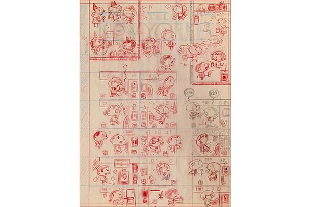
Red pencil sketch of "Ecosystem": This was the final pencil sketch. At this point, the positions of each character are finalized. As can be seen here, the initial "germ travel" concept eventually became a small part of a larger composition, with other little stories thrown in. I couldn't come up with any workable perspective(s) for the scene, so I simply invented my own. After a final ink drawing, the logo and vertical "strap" are added, the final cropping is decided upon, and it's pretty much ready to go to press.
How much do you consider the New Yorker audience during the process?
My audience exists solely inside my head and consists of: Françoise Mouly, my friend Chris Ware, and my wife. If anyone else likes the covers, that’s a bonus. I have no idea who is reading the magazine, really, and I can’t predict what anyone will like or not like. I try to amuse myself, and hopefully I am not so different from the rest of humanity that my sense of humor is un-transmittable to others. I can usually get a chuckle out of someone. So I try to trust that instinct.
Having said that, I move some stuff “off the table” at the outset; there is no way some horrifyingly violent, explicitly sexual, or otherwise transgressive image is going to fly on the cover of a mass-market magazine. There’s a time and place for everything. I think this is just common sense.
In Cartooning you quote the Italian writer Marcella Hazan, who says that originality should not be an explicit goal, but can be a consequence of your intuitions. How are your covers, comics and drawings consequences of your personality, experiences or intuitions?
Anything I have drawn could only have come out of my perceptions, my experiences, my history. Everything is autobiographical on some level, even the things I was intentionally trying to make not-autobiographical ended up revealing something about me. Whenever I have tried to be clever, the results have been abysmal, go-nowhere failures.
This is something I want for my students to understand: if you can tap into something deep, honest, and personal, and risk letting your guard down to express the things you feel most vulnerable expressing, well, you just might tap into something real and universal—and hopefully lasting. That’s all any of us can hope for.
***
Student illustrators remind us that even when it comes to large-scale murals, it all starts with a sketch.